Shorter Header Increases Conversion Rate By 107%
NOTE: These screen shots may not be safe for work.
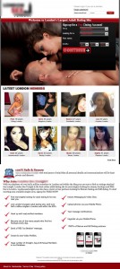
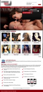
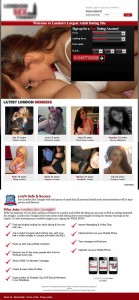
Recently we ran a test for LondonSexTonight.com, an online adult dating site. The results were great, but also interesting. We ran some categorical changes in this test, and just 1 single-variable change. Surprisingly, the winner ended up being a variation with simply a shorter header. I’ve seen good increases from shortening the header before, but not this big. Now, you may be thinking, “why the hell would a shorter header change anything?!”, and the answer is actually pretty obvious when you look at the web through a smaller resolution. Here are all the different variations:

Control LP:

Shorter Header:+107%

Multi-Step Form:+71.99%

Alternate Image:+20.81%

Lesbians Image:+5.41%

Alt Headline: -17%
Conclusions
First, let me explain why the shorter header did so much better. The average screen size currently is about 1280 x 1024. When you take into account the size, of the browser header, the browser footer, and the fact that many people dont maximize their browser windows, this is what the average visitor to this site probably sees.
There are 2 negative effects this large header has at this resolution. First of all, its a large amount of real estate. The header is 150px tall. If you assume the user is left with 800px of height on their browser, that means the header takes up about 20% of the height. However, the header serves no real purpose in “selling” the user. Also, it means you lose 20% that you could have used to help convince the user not to bounce.
Another thing to notice is that most of the “Latest London Members” section is cut off. Being a dating site, I would say seeing what members are on the site is pretty critical to the user. This is probably the main reason it made such a big difference. Now, you may be thinking, why does it matter if they can just scroll down? The thing is most users who leave dont scroll, they bounce. They use what they initially see to decide whether to see more of the site and leave, and them seeing faces of a few members that are on the site just happens to be the thing that makes them say “alright ill take a look”.
The multi-step form also performed very well, over 70% better. By combining these 2 winners, we would have an extremely strong page. As you can probably infer, after running this test you can conclude that the best landing page would have a shorter header, a multi-step form, and have the alternate hero image.
Next time you create a page, really think about how you are using your real estate. Don’t let space go to waste by making things too big or having lots of whitespace - make every pixel count!


