
How to Create a High-Converting Landing Page
For all of you who are new to optimizing landing pages, we’ve put together a system you can follow that will allow you to avoid making mistakes that cause low conversion rates. If you are not very experienced at making landing pages, you will see much better results by fixing your mistakes rather than trying to add improvements. It’s kind of like fixing a flat tire on a car v.s. adding a turbo. If the tire is flat, fixing it is more important than the turbo since the car cannot operate with a flat regardless of a turbo.
Okay, so let’s get started. My goal with this post is to give you a mental checklist of things to do whenever you are making your landing pages.
1. Identify the ultimate value of the page you will be creating
Let’s assume that your landing page is not allowed to have any images, background, or more than 10 words of content. So pretty much all you get to use is a white background, and 10 words of text - that’s it. What would you write? Even if you are reduced to this you can still have a decent landing page as long as you clearly communicate your true value. Also, don’t use qualitative words like ‘best’ or ‘cheap’. Those words are relative. Online, we are immune to such words. Use words with absolute value, like ‘10 dollars’ or ‘4.5 Ghz Processor’. Here’s some examples:
-
Education (Good): “Offering 34,192+ Accredited Online Colleges”
-
Education (Bad): “We Have The Best Schools For You!”
-
** Virus Software (Good):** “Remove 100% of Viruses. Updated Daily”
-
** Virus Software (Bad):** “Viruses Won’t Stand a Chance Against Our Virus Software!”
-
** Retail (Good):** “Over 1,000+ Products at least 25% off Retail From [Brand], [Brand2], [Brand3]…”
-
Retail (Bad): “Check out our store and find out why it’s the hottest spot in town!”
Don’t ever fall for the belief that adding the right image or that design will boost your conversions rates much. These value propositions are all that matters. Imagine you had a medication for headaches and the value proposition was “Cure your Headache Now.” Now imagine changing that to “Cure your Headache, and any type of Cancer.” A few extra words that would literally make you millions if it were true. Hopefully you can see the difference I’m trying to point out within those value statements. Every single element on your page should communicate this statement, or be congruent with it! Once you got your value proposition, you can start building your page.
2. Identify specifically the actions the customer will need to take
You need to know exactly what you want the customer to do. Do they need to fill out a form? If so, what fields? Address? Credit Card Number?
3. Minimize the steps required for the customer to convert
Once you know exactly what they need to do, remove any steps that are not absolutely necessary. You honestly do not need anyone’s city or state if you know their street address and zipcode. However, you would be surprised by how much your conversions will rise by simply removing those 2 fields. Also, take advantage of pre-population on the forms if it’s an option. This is done by using PHP in order to pre-populate the form. For example, if the visitor landed on your page from an e-mail newsletter, then you already have at least their name and e-mail address. Using PHP/Javascript, you can set up your page so that when they get there those 2 fields are already filled out for them. If you don’t know how to do this, just google it or hire someone.
Not this:
But this:
4. Relieve any anxiety the customer can experience
Besides your value proposition, this will probably have the biggest effect on your conversions, assuming you have elements causing anxiety. If you have a zip submit you probably won’t experience much but if you are asking for any personal information or a credit card number you will definitely experience this. I read a case study once that resulted in a 400% increase in conversion by adding one of those secure logos on the credit card page. Think about how many free trials you didn’t take just because it asked for your card info. Unless you forget to cancel the trial, you literally would not pay anything for the trial, hence the name ‘free trial’. But as soon as you see that credit card field, you experience anxiety, and leave. Anxiety is a huge thing in landing pages, but for a beginner who hasn’t seen the results firsthand, it is hard to perceive.
The first thing you need to do is identify where anxiety happens. Once you’ve done that, you will need to figure out how to relieve it using an element such as an image or content. Last, you will place that element as close as possible to the point where anxiety is caused.
Let’s take an example. Let’s say my landing page offers a phone. I’m obviously going to need a credit card form. Once the customer sees that, they will experience some anxiety, so I must add a secured trust logo immediately under the credit card field, so that they see the logo at the same time that they see the credit card field, and they at least feel a bit more secure about buying. Now, we are going to assume the customer has never seen the phone in person. This is going to cause more anxiety because they will have questions in their head such as ‘How big is it?’, or ‘How much music can it hold?” If this is the case, they aren’t gonna call you and ask - Most likely they will leave. So, think about these questions that your prospect may be thinking of, and answer them before they ask it in their heads by putting it on your landing page.
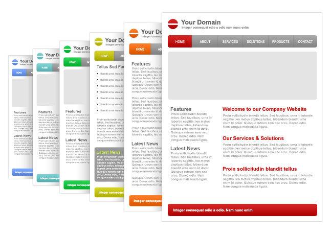
5. Design your page layout
The next thing you need is a page layout. Generally you should use a page that has an up-down format. However, don’t make a sales-letter-type page that is a mile long! Best case scenario, there should not even be a scroll bar for them to scroll unless you need it! I would put a header at the top, a nice video or image, and under that some content. Make sure your value proposition is communicated in BIG letters on the headline. Make sure your content answers all their questions. If you have the form on another page, make sure the lander has many links and buttons to get to that next page. If the form is on the landing page, I prefer to put it under the header, to the right of the image/video.
Once you have a layout thought up, look at it and see where your eyes naturally flow. If you were to draw a line from where your eye starts when you first land on your page, and then where it ends after you took a look at the page, it should look like a line starting at the top, and going straight down. It doesn’t have to be like that exactly, but the simpler it is, the better. If you have a form on the lander however, don’t put it at the bottom. You want it near the top.
Also, don’t put many links on your lander other than the ones leading to the next step in the conversion process.
6. Check for congruence
Once you have your page designed and filled with content, look it over and make sure everything is congruent with each other. Make sure the images are communicating your value proposition. You don’t want a picture of a pale girl if you’re selling tanning lotion. Make sure the same value proposition in your headline is also on the next page, and any ads that led up to the landing page.
If your traffic is coming from a magazine ad, let them know of your special ‘magazine offer discount’ or whatever. You should have your landing pages catered to the traffic source.
There’s a lot more you can do to raise your conversions, but these are the essentials, minus your traffic source. Traffic sources are very diverse and you cannot have one landing page that can cater to them all. If anyone follows this system they will avoid many mistakes that almost all landing pages make. If you’ve completed all the items outline here, take it a step further and go through this checklist to see even more results. Please give feedback on how much this system helped you, I’d love to hear it!

