

3 Consecutive Wins for TinyTotties.com
Tinytotties is an e-commerce site which sells baby bedding sets and kids room decor. We ran 3 experiments for them and saw some nice improvements in conversion rates as well as revenue-per-visitor in all 3 tests. They did a great job helping us develop the experiments. It’s important to setup global tests when testing e-commerce sites and their team did a great job implementing our tests.
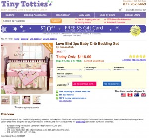
Test #1
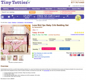
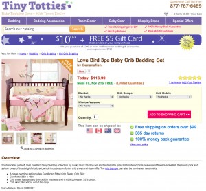
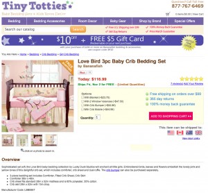
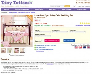
Test Page: Product Pages
Variations: 4
Hypotheses:
- Variation 1 (Anxiety Relief): Addressing concerns that the visitor may have when deciding whether to purch ase a product will decrease their anxiety level, therefore increasing conversions.
- Variation 2 (Proximity + Add-on Friction): We noticed that many yes/no options were using select lists instead of radios or checkboxes, and were creating friction by making it seem like it was a multiple-choice question. We replaced these with tickers and used the extra space as a place to put our anxiety-relieving elements.
- Variation 3 (Head-less): Previous tests have shown that shorter headers usually convert better due to browser sizes - We removed the top banner and moved the search box above the navigation to test this.
- Variation 4 (Scarcity): We wanted to test the effect on scarcity on their visitors - we accomplished this by changing the price label to “Today Only:”[/list]
The Variations (Click to enlarge):
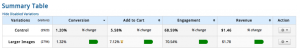
Control LP 7.01%
Anxiety Relief:+31.91%
Proximity + Friction:+20.55%
Shorter Header:+18.74%
Scarcity: +4.07%
Conclusion: All of our hypothesis had positive results on conversion rates - we ended up putting together all the concepts we learned and implementing them globally.
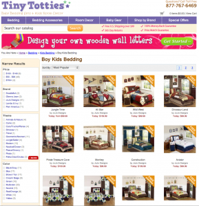
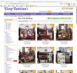
Test #2
Test Page: Category Pages
**Variations: **1
Hypotheses:
- Variation 1 (Larger Images): With 4 products per row on the category pages, it was hard to see any details of a product without zooming into it. We thought putting just 3 products per row would increase engagement.[/list]
The Variations (Click to enlarge):
Control: 7.01%
Anxiety Relief: +22% Revenue-per-visitor
Result: The Variation saw a 22% increase in revenue-per-visitor. The overall conversion rate increased 11%, which means revenue-per-conversion also increase.
Conclusion: Visitors will engage more when product details are clearly visible.
Test #3
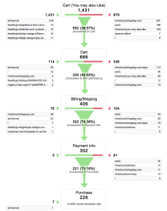
Test Page: “You may also Like”
Variations: 1
Hypothesis: On this particular site, visitors were being sent to a recommendations page after hitting “add to cart”, instead of the cart page. We wanted to see how effective this was, so we set up a custom funnel in Google Analytics. We found that the recommendations page had a pretty high exit rate - about 60%. We wanted to test the effects of removing this un-necessary step.
Results
Conclusion: Removing this extra step increased overall revenue-per-visitor by 32.91%.
Want these types of results on your site? You should hire us.

