

Removing Divider and Applying 70/30 Rule Increases Conversions By 103%
Building Guide is sort of like kayak for buildings - You choose what type of building you want, whether it’s a shed, a garage, or something industrial - and BuildingGuide provides you with quotes from 4 different suppliers at once. They felt like their conversion rate could use some work so we optimized their site, and were able to literally double their conversion rate.
For this first test we wanted to test what kind of layout would work best. We came up with 2 alternatives:
**Variation 1 (Divider-less): **In this variation we did 3 things - First, we removed the divider. We felt that the division was causing friction to the page. We also removed the grey background behind the left content area in order to remove the feeling of division on the page. Also, we made the left side 70% width, and the right side (CTA) 30% width. This has been shown to be a best practice for landing pages time and time again.
**Variation 2 (Single Column: **As I said earlier, this site is sort of like kayak for a different industry. So we decided to try a layout similar to kayaks, which is a single-column, vertical layout.
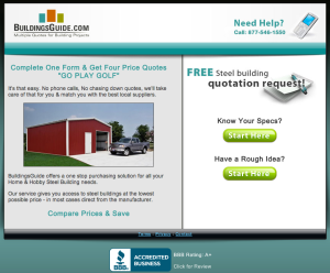
The Variations (Click to enlarge):
 [image id=”882” size=”medium” link=”true” align=”left” shadow=”true”]
Control LP: 5.30% Conversion Rate
[image id=”882” size=”medium” link=”true” align=”left” shadow=”true”]
Control LP: 5.30% Conversion Rate
 Divider-less: +103.30%
 Proximity + Friction: +67.70%
Conclusion
Honestly, I thought the single-column page was going to win. I figured kayak had probably done tons of split-testing to get to that page, but in the end it’s all about the visitors, and they are not all the same. With this experiment, we were able to double the overall conversion rate which we are very proud of.
Want results like this? You should hire us.

