

Case Study: Bogtus Real Estate
Bogtus Apartment Acquisitions is an Apartment Real Estate Broker, and came to us because they were experiencing low conversion rates on their landing page. According to the client, their landing page conversions were “well under 1%”. After looking at some stats we saw it indeed was between .2-.5%, and we decided to take on the challenge of optimizing it. Now, we knew real estate is a very high competition industry, with sky-high CPC’s. That’s because their margins are high, and they can actually profit with those CPC’s even with low conversion rates. After an optimization that included a complete re-design of the site, we were able to get the site to convert at 5.06%. Unfortunately, we weren’t able to collect as much data as we wanted before the job was over, but the client decided it was okay to stop the experiment early because they were “more than satisfied with the results” :). Now on to the good stuff:
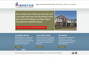
First of all, the page was built on wordpress, and I prefer to create my pages from a blank html file in a text editor, so we scrapped that site altogether, and started a new design. A lot of the time it’s easier to start from scratch than to try and fix a broken site. The very first thing I noticed on the old site was the headline. It wasn’t clear at all, and was way too long. Not to mention, the headline on the old landing page didn’t even communicate the value very well. I knew we were going to see some big increases here.
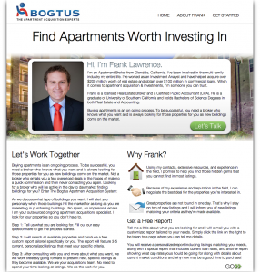
Another thing I noticed was the form. On the old landing page, there was a button labeled “Click here to get your free personalized report”. Once you cliecked it, you were led into a page with a very long form that made you just want to get out of there. The idea was that visitors would fill out this form to submit information about the type of place they were looking for, and the realtor would email them back with some listings matching their criteria. After the optimization, we actually used the same fields with the same names, and we still got a good enough conversion rate out of it that we kept it, since the report helped a lot to create the sale. The goal that needed to be accomplished here is to communicate value well enough to where it would be well worth it to request a report. I changed the headling to “Find Apartments Worth Investing In”. This was a lot more effective than the old headline which basically seemed to go in one ear and out the other. It instantly communicated what he offers (apartments), and why they should choose him (worth investing in). Value propositions hold lots of weight in performance and are one of the first things you should test in any landing page optimization.
Another key thing I realized is that what this website was really about was being communicated incorrectly. This site is for one broker, not multiple brokers. Therefore, this site should be communicating the value of ‘a broker’, rather than a ‘brokerage firm’. I decided to completely scrap out the idea of putting graphics of apartments on the landing page, and decided to use a photo of the broker himself with an intro. In the end, they aren’t hiring a firm, but rather a single person. This gave me an opportunity to use the concept of transparency which I believe is one of the best ways to gain credibility. By putting a nice first-person intro about the broker rather than a business description, users get the feeling of being more ‘connected’ and less like the site is trying to get something out of them. The results were great!
The old page had no content at all. I added some key points as to why they should choose him, and also included some content that used to be on the page that lets you get a free report. More importantly, I wrote some of the intro copy which I believe was very effective. I made sure to use quantitative statements, which is probably the most important thing when creating copy. This lies on the principle that “numbers don’t lie”. If I tell you my friend is a good basketball player, you get a vague idea of his “goodness”. However, if I tell you he “score nine 3-pointers in a row”, you have a clear idea that the guy can play. Use that concept often.
Another feature I added was an email capture on the first page. Just in case they didn’t fill out the report inquiry, the realtor would at least capture some contact information to follow-up with. This is a fundamental thing to be tested on all sites that use a long form or funnel. I also changed the button to say ‘Let’s talk’, since that really is the goal here: to connect a apartment-investor with the apartment-broker.
I hope to hear your feedback, as well as other things you guys would’ve done to create even better results!

