

Case Study: MeetChristians.com
Meet-Christians.com is actually a dating site that I own. I started out as an affiliate marketer and eventually started my own dating site through a white-label company on the way. At one point I was running a lot of traffic for ChristianMingle and wanted bigger margins and the success with Christian Mingle gave me the confidence to start my own site. Anyways, that along with a bunch of other campaigns I ran as an affiliate marketer is what got me into Landing Page Optimization. My page was already converting as high as Christian Mingle’s page however I believed I could do better. It was not much of a change (in terms of a scientific approach) but the design is obviously different. This saw a relative increase of 20%, and is actually converting more like 15% as of this writing.
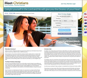
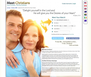
Usually what drives me to do these optimizations is an idea I get out of nowhere. One day I just got the idea that since this is a dating site, which is about people, images of people together would be most powerful, because it serves as a effective graphical way to convey people meeting. Eventually I would like to use statements like “Over xxx members” and “xxx relationships started” but my site is nowhere near a point where I can make statements with big numbers. Therefore I just wanted to convey people meeting more by graphically focusing on it. The new version of the page simply uses a similar image of a couple but it takes up the whole page rather than just a section. I also removed unnecessary copy and added some arrows pointing towards the form.
The arrows help direct attention, just like if someone close to you pointed to something, you would probably look where they are pointing without even thinking about it. Also, I set up the page so that it reads like a “stair-case”, in which if you start reading from the logo downwards, it naturally leads you to the form. This isn’t a 100% tried-and-tested technique so don’t take it as fact, however I’m currently testing it on jobs to get more data on how effective it is.
I plan on doing another optimization soon for this that integrates congruency, in which the user sees similar content & value ideas all the way through the conversion process. An example of this would be if the user saw the same girl and headline on the landing page as they saw on the ad they clicked to get there.
I hope you take some good ideas from this!

