

Optimized Homepage Increases Revenue By 37.21%
Morninghead is an awesome startup which was successfully funded by kickstarter. They make an awesome product that gets rid of bedhead in seconds - a perfect solution for people who shower at night. We ran an experiment for them which resulted in a 37.21% increase in revenue-per-visitor. We’re going to share all the nitty-gritty details with you.
After initially reviewing the website we felt this was a perfect candidate for an experiment with multiple variables changed in the new page rather than a single variable change. This allows for greater range and is usually ideal for sites where you feel like lots of variables need to be changed immediately.
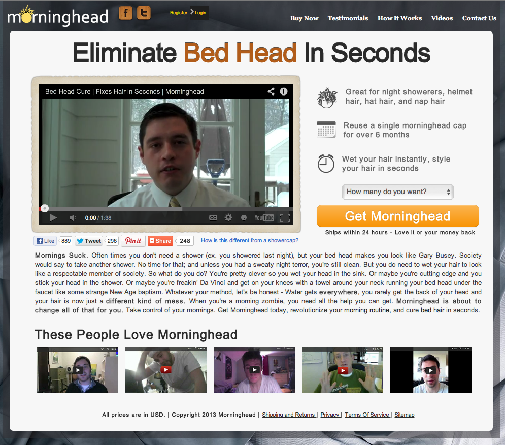
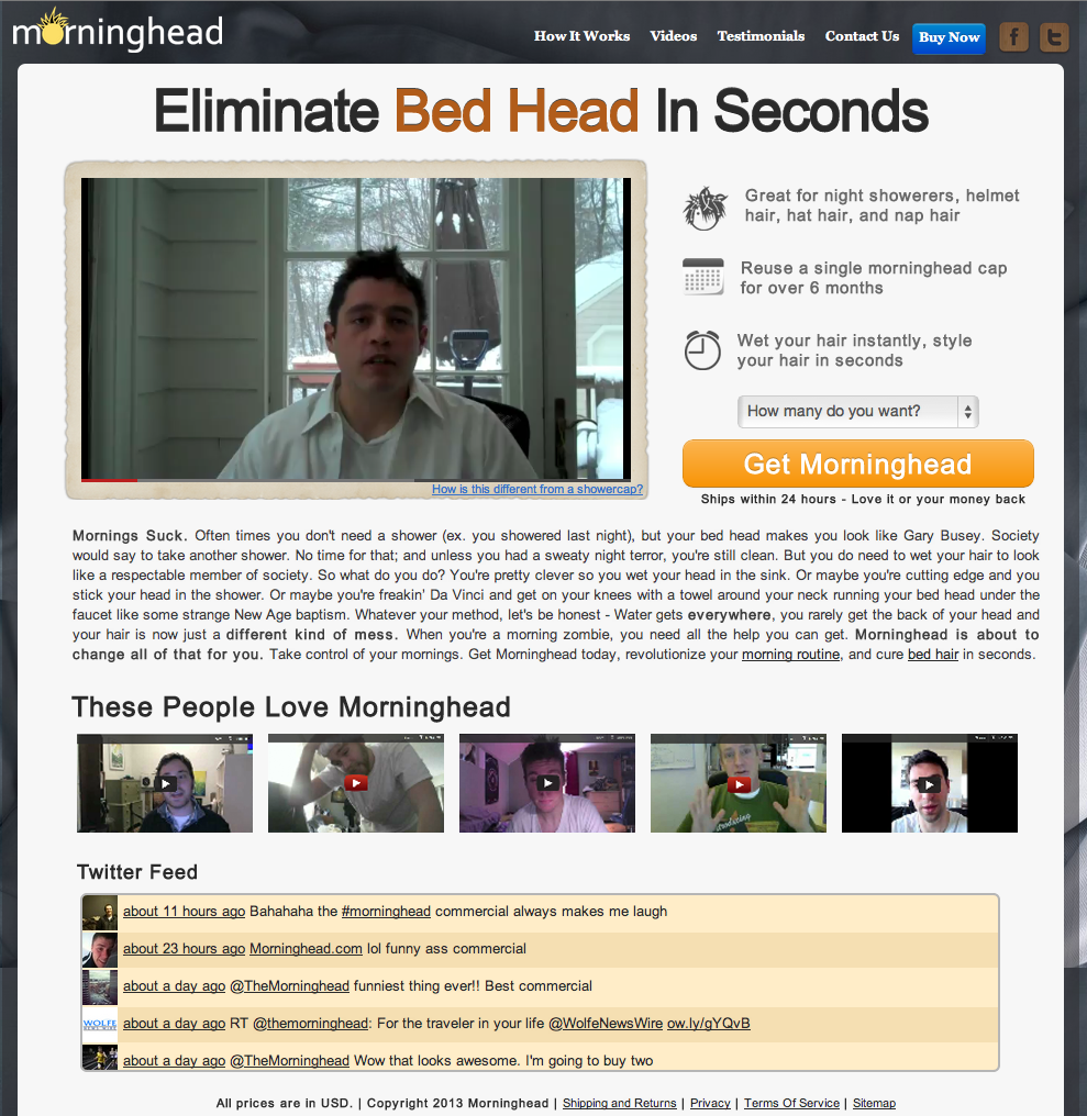
The Variations (click to enlarge)
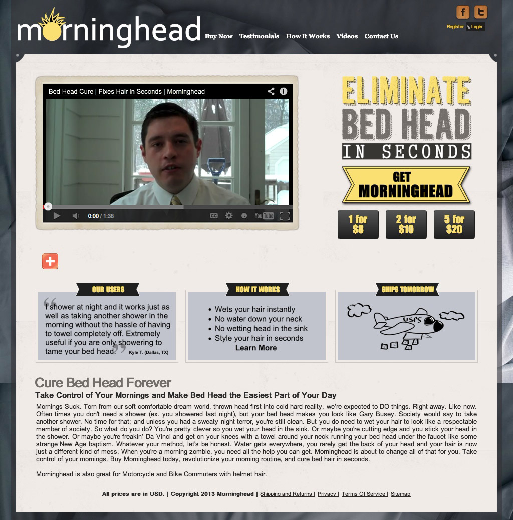
Control LP: $0.15 revenue-per-visitor
New Layout (No Twitter): $0.21 revenue-per-visitor (+37.21%)
New Layout (With Twitter Feed): $0.18 revenue-per-visitor (+14.05%)
The Changes
Here’s what we changed and why:
[dropcap]1[/dropcap]Smaller header: If you read our case studies you should already know we do this on almost every experiment because it’s always produced results for us. Read more about it here.
[dropcap]2[/dropcap]Used social toolbar that has counters: Without the counter, social buttons really give you no credibility.
[dropcap]3[/dropcap]Moved headline up, centered it, and made it stand out more: Usually we have to change up client’s value propositions because the original isn’t good enough, but this one was pretty good to begin with. It tells you what it does, and why it’s gonna benefit you. However, it was very dull and didn’t stand out. Headlines are one of the biggest factors in bounce rates, so it’s important that it stands out. I’m very sure that this change was key to the variation’s success.
[dropcap]4[/dropcap]**Replaced headline and the text under it with benefits: **We were left with some empty space by removing the headline - this gave us a perfect place to add some benefits and key points.
[dropcap]5[/dropcap]Reduced friction on the CTA: Having 3 buttons, equally weighted and next to each other is almost always a bad idea. Why? - because you effectively reduce the relative weight of each one to 33.3%. We decided to put a select list instead to choose the quantity. We added some anxiety-relieving text under it.
[dropcap]6[/dropcap]Removed the 3 boxes under the video: Because we added video testimonial we no longer needed the “our users” container that had a single text testimonial. Also, we moved the benefits in the “how it works” container to replace the old headline section (By the way, that should’ve been called benefits, not ‘how it works’). And last, we have no need for the “ships tomorrow” container because we added that as text under the CTA. This let us remove that whole section completely, and put the description there instead.
[dropcap]7[/dropcap]**Added video testimonials: **Video testimonials always tend to be the most effective - therefore we added those to the homepage rather than text testimonials.
Our 2nd variation container a twitter feed - We wanted to test the effects of this separately because it took up a lot of real estate. It ended up having a negative effect on conversions - an interesting thing you should take note of before adding a twitter feed to your own site. It’s distracting. Distraction causes friction.
Another key thing to note: We also tried forcing the user to buy 2 for $10 by removing the select list and changing the CTA text to say “Get 2 for $10”. This performed horribly. Keep this in mind, and if you want to do something similar, make sure to test it.
I hope you guys get some good insight from this to use in your next experiment, and to optimize your own sites. Feel free to leave feedback in the comments below!
Want us to optimize your site? Contact us!

